Yes, we agree to disagree... but it is an objective fact that these calligraphies were carved by artists who had a much deeper understanding of calligraphy and greater skill than both you and I.Bok wrote: ↑Thu Jul 08, 2021 9:15 am
There is indeed an art to combining radically different styles of typefaces/calligraphies, it is one of the most difficult tasks for any calligrapher/designer. I have to agree to disagree, most, all actually, Yixing I have seen, fail at getting this dynamic-tension-balance right...
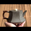
Yixing

Also a fact that be it western or eastern designers, the calligraphers are ofte. known to be excellent in their craft of writing, but not the best designers of overall compositions… specialised and highly skillful yes, but often limited as designers of the whole. That is a totally different skill set and not always found in the same person. There is a long list of famous calligraphers, but who where average designers.steanze wrote: ↑Thu Jul 08, 2021 2:44 pmYes, we agree to disagree... but it is an objective fact that these calligraphies were carved by artists who had a much deeper understanding of calligraphy and greater skill than both you and I.Bok wrote: ↑Thu Jul 08, 2021 9:15 am
There is indeed an art to combining radically different styles of typefaces/calligraphies, it is one of the most difficult tasks for any calligrapher/designer. I have to agree to disagree, most, all actually, Yixing I have seen, fail at getting this dynamic-tension-balance right...
You still need someone to bring it all together, maybe that person is too blame, haha.
Pot: 100points
Calligraphy: 100points
Whole object: 50points

Interesting opinion, which I think is very far off the mark.Bok wrote: ↑Thu Jul 08, 2021 7:49 pmAlso a fact that be it western or eastern designers, the calligraphers are ofte. known to be excellent in their craft of writing, but not the best designers of overall compositions… specialised and highly skillful yes, but often limited as designers of the whole. That is a totally different skill set and not always found in the same person. There is a long list of famous calligraphers, but who where average designers.steanze wrote: ↑Thu Jul 08, 2021 2:44 pmYes, we agree to disagree... but it is an objective fact that these calligraphies were carved by artists who had a much deeper understanding of calligraphy and greater skill than both you and I.Bok wrote: ↑Thu Jul 08, 2021 9:15 am
There is indeed an art to combining radically different styles of typefaces/calligraphies, it is one of the most difficult tasks for any calligrapher/designer. I have to agree to disagree, most, all actually, Yixing I have seen, fail at getting this dynamic-tension-balance right...
You still need someone to bring it all together, maybe that person is too blame, haha.
Pot: 100points
Calligraphy: 100points
Whole object: 50points

It's quite simple really, all I am saying is that for example a talented architect is not necessarily a talented graphic designer, a brilliant product designer not necessarily an excellent illustrator, those are all different disciplines, which require different skill sets.
Which is completely normal. The Da Vinci kind of universal talents are rare.
What I am saying is that decorated pots did require interdisciplinary collaboration, which in my opinion in many cases lacked the artistic vision to create a harmonious whole. I think as far as carved calligraphy/illustrative teaware goes, the Japanese often, but not always, did a better job...
Still in the end, I prefer them plain, no matter the quality. But to each their own.

I am consistently amazed at how well Chinese calligraphy have been blended into all sorts of objects, teapots being no exception. Of course, at the price point I could afford to pay both the caligraphy viewed in isolation and the overall integration of it into the pot is bound to be pretty poor. But those finer examples even us commoners are allowed to view photos off... simply marvelous! (The ones @steanze posted some pages back firmly belonging to that group.)
There's always the "subjective opinions", let's agree to disagree etc., which is a civil way to round things off. But I am curious: what is the the general view among collectors and art historians on this?
And those famous calligraphers who where average designers, do we have a couple of examples? I imagine "average designers" here meaning average at integrating their calligraphy onto other objects than ... paper? Basically anything where the calligraphy itself is not only design element of the "whole" to which it belongs. And not that they were famous calligraphers whose calligraphic design was average?
As far as Western calligraphy goes, https://en.wikipedia.org/wiki/Hermann_Zapf comes to mind, a brilliant calligrapher and type designer, who among others designed the typefaces Palatino, Optima, and Zapfino, which some might find on their computers. But he was less good in being a graphic designer in the more general sense. Some, although still in a very close discipline were not even good book designers.Balthazar wrote: ↑Fri Jul 09, 2021 3:08 amAnd those famous calligraphers who where average designers, do we have a couple of examples? I imagine "average designers" here meaning average at integrating their calligraphy onto other objects than ... paper? Basically anything where the calligraphy itself is not only design element of the "whole" to which it belongs. And not that they were famous calligraphers whose calligraphic design was average?
I personally also do think that the medium of a teapot is not the most apt to display characters in general.
Notably, craftswomen/-men like Ōtagaki Rengetsu did an outstanding job in integrating the form, shape and texture of the object with the "flat" nature of the writing. Doesn't really get much better than that in my opinion. Represents to me the ideal of how harmony in this context can be achieved.
To a lesser extend the poems on certain Yamada Jozan works are also very balanced and complimentary to the teapot.
Back to the crux of the matter, the mixing of different styles of typefaces – this is a hotly debated and tricky subject discussed since ages by design professionals, countless books are written on it and how to achieve balance. It really is not an easy task.
Exactly!Balthazar wrote: ↑Fri Jul 09, 2021 3:08 ammeaning average at integrating their calligraphy onto other objects than ... paper? Basically anything where the calligraphy itself is not only design element of the "whole" to which it belongs. And not that they were famous calligraphers whose calligraphic design was average?
Also worth noting that I am being overly critical in this case as design is my profession and I am holding anything regarding typefaces to a higher standard
Thanks @Bok, we all have our occupational hazards but if this is "ranting" it's of the best kind 
"I personally also do think that the medium of a teapot is not the most apt to display characters in general."
What about museum pieces such as the ones below, would they be more to your liking if they were plain without any carvings?


(These are from Chen Hongshou (the "Eight Masters of Xiling" one, not the earlier and more famous one))
"I personally also do think that the medium of a teapot is not the most apt to display characters in general."
What about museum pieces such as the ones below, would they be more to your liking if they were plain without any carvings?
(These are from Chen Hongshou (the "Eight Masters of Xiling" one, not the earlier and more famous one))
It is quite simple, and yet incorrect... a lot of thought went into the integration between calligraphy, content and shape. For example, the upper handle pot I posted earlier is discussed in greater depth here: https://shuocha.wordpress.com/2021/03/1 ... es-shapes/ in brief, the shape is inspired to ancient bronzes from the Han dynasty, and the square script used is based on the square script that was used on such bronzes during Han. The squareness of the script contrasts with the round shape of the pot. The calligraphy on the other side reports a couplet attributed to a scholar of Han inscriptions. Obviously a lot of thought went into integrating the shape of the pot with the writing both in terms of style and content to create a harmonious whole. If it does not match your personal preferences, that is your opinion, to which you are entitled. But it seems like part of it stems from a lack of understanding of the piece.Bok wrote: ↑Fri Jul 09, 2021 2:42 amIt's quite simple really, all I am saying is that for example a talented architect is not necessarily a talented graphic designer, a brilliant product designer not necessarily an excellent illustrator, those are all different disciplines, which require different skill sets.
Which is completely normal. The Da Vinci kind of universal talents are rare.
What I am saying is that decorated pots did require interdisciplinary collaboration, which in my opinion in many cases lacked the artistic vision to create a harmonious whole. I think as far as carved calligraphy/illustrative teaware goes, the Japanese often, but not always, did a better job...
Still in the end, I prefer them plain, no matter the quality. But to each their own.
This approach of reflecting on the relationship between the carvings and the teapot shape occurs quite often, for example the teapot I have on my avatar has a carving of a poem about water sitting still in a well in winter, and the hexagonal shape is typical of ancient Chinese wells... after all, this tradition of carving goes back to people like Chen Mansheng, and these works (unlike the sutra pots) were destined to highly educated literati who were well able to appreciate these connections.
But as you say, to each their own, it is not mandatory to appreciate these things.
A theoretical concept of how and why to use this or that script is one part, but it does not necessarily result in a visually pleasing object.
If I have to look at an object in my environment, I judge it by it’s appearance not by it’s inner values.
It’s like an ugly painting, no matter how good the concept is, if it’s not appealing, few will put it up in their living room.
And the discussion of understanding background of a given topic to appreciate it is another old age discussion not worth repeating.
Or do I have to understand the language of a song to be touched by it? Certainly not.
Coming back to matching to pots. My issue with these is that one side’s calligraphy usually matches shape and style, while the others matches neither pot nor the other side’s writing. Put them next to each other on a piece of paper and tell me they look good together…
You may indeed need to understand the language of a song to fully appreciate it... but that aside, while it's unfortunate that you do not appreciate these works, it is ok, most art is not appreciated by everyone. I have even encountered people who do not appreciate the paintings by Klee, and many who do not appreciate the music by Stravinsky, so it's not surprising that there would also be people who do not appreciate teapots with carvings. As I am sure you understand, your idea of what "matches" and what doesn't is very much you own subjective preference - I definitely think they would look good together on a piece of paper next to each other, and those who carved it thought they would look good together on a teapot (with which judgment I strongly agree).Bok wrote: ↑Fri Jul 09, 2021 6:33 amA theoretical concept of how and why to use this or that script is one part, but it does not necessarily result in a visually pleasing object.
If I have to look at an object in my environment, I judge it by it’s appearance not by it’s inner values.
It’s like an ugly painting, no matter how good the concept is, if it’s not appealing, few will put it up in their living room.
And the discussion of understanding background of a given topic to appreciate it is another old age discussion not worth repeating.
Or do I have to understand the language of a song to be touched by it? Certainly not.
Coming back to matching to pots. My issue with these is that one side’s calligraphy usually matches shape and style, while the others matches neither pot nor the other side’s writing. Put them next to each other on a piece of paper and tell me they look good together…
That is a good thing though, it means that although you have been learning quickly, there are still more exciting things to learn in the world of Yixing...
Thanks for sharing these beautiful works by Chen Hongshou, the calligraphy is well integrated with the shape. Chinese calligraphy is art, and it would be very misleading to judge it as design, comparisons with fonts like palatino are entirely out of place.
Last edited by steanze on Fri Jul 09, 2021 7:39 am, edited 2 times in total.
To answer this question, it depends substantially on the level of the carving. Some carvings like the ones on F1 pots or the ones on ju lun zhu with the heart sutra don't add much value to the teapot. By contrast, works by known masters with good calligraphy often fetch prices that are about double those of typical Qing zhuni teapots, and sometimes much more. I think that is a clear indication of the view among collectors... For art historians, I believe they are not as concerned with establishing which style is "better", and more concerned with understanding the place of a style in the development of aesthetics over time and its connection with other aspects of culture and society at their time.