The Porcelain Thread

I'm guessing B is the factory gaiwan due to it looking higher quality on the print, but I could see how the lighter one could be older too. I just feel modern rice grain stuff I see is so janky, but I also don't see that flower pattern used much then either. now I am curious @sheep.payday2
I am also a fan of those rice grain porcelains. I feel like the modern ones are too perfect or too rigid, and lack of the artisan touch. I tend to go after the hand painted ones.wave_code wrote: ↑Wed Jan 24, 2024 3:33 pmI'm guessing B is the factory gaiwan due to it looking higher quality on the print, but I could see how the lighter one could be older too. I just feel modern rice grain stuff I see is so janky, but I also don't see that flower pattern used much then either. now I am curious sheep.payday2
Here is a latest porcelain find, not rice grain and probably not made in china.
- Attachments
-
- thumbnail_IMG_5057.jpg (116.86 KiB) Viewed 2292 times
-
sheep.payday2

- Posts: 14
- Joined: Sun Jun 11, 2023 1:54 pm
- Location: Finland
Why not 光造? (disclaimer: I know a lot more about calligraphy than about Japanese pottery marks.)
B is from the factory era, A is newly made retro porcelain.
The rice grains on B are large and regular, and the printing looks "moist". The most important difference cannot be captured in photos: hand feel. The older glaze is thick, has a greasy to vitreous lustre and an eggshell blue tint to it. Retro clay is relatively coarse, gray-white, and the glaze is thin.
That said, that factory gaiwan is far from the best thing ever. It's thick and heavy, and the lid is warped. It's not hard to find a modern one that's easier to use. And yes, the bulk of rice grain stuff that I (and you) see in the wild is jank. However, some PRC factory pieces are actually good, and I appreciate the cultural and economic history that they carry.
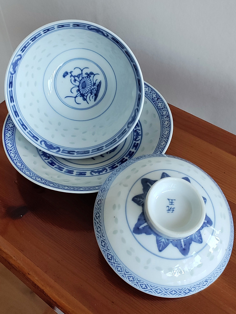
I'll share one nice and presumably older (5/6/70s') gaiwan below. The key fret "工工工工工" border seems to have been painted by hand, although the rest is stampwork.
@DailyTX fully handpainted pieces are on a whole different level – even the bad ones pass as quaint, and the best really deserve to be called exquisite.

Outside by multaa, on Flickr
Inside by multaa, on Flickr
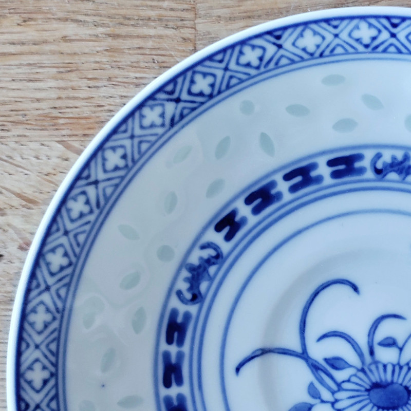
plate by multaa, on Flickr

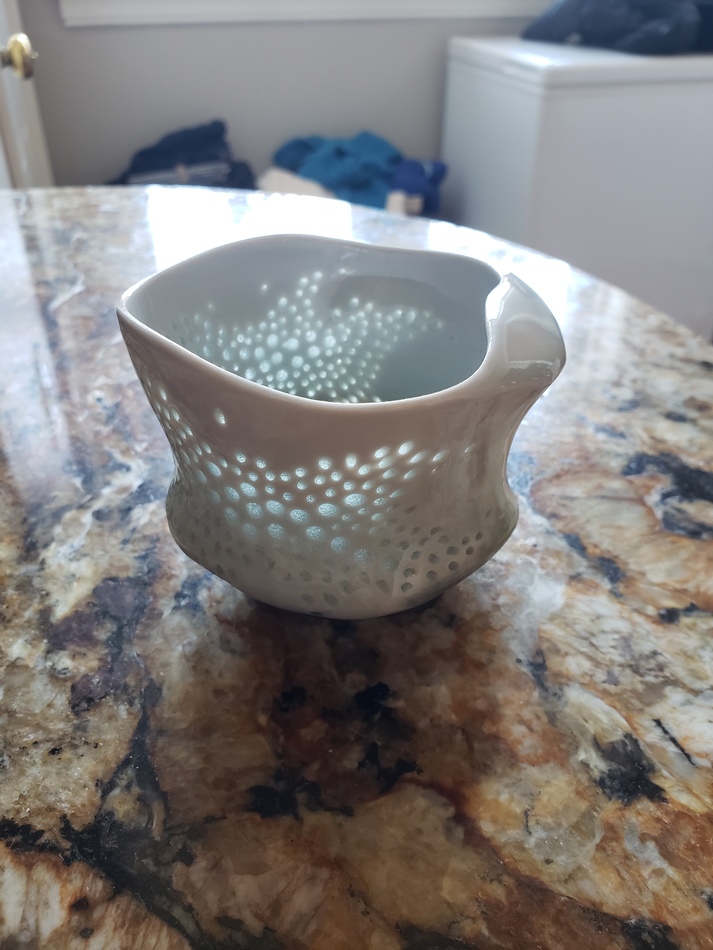
This one has been a bit of a mystery/curiosity and for reference I'd like to try and figure it out. Celadon color but on the very light side, a modern CZ cup and Qing green bean cup are pictured here for color reference. In some ways it seems older - shape, glaze/firing imperfections, lack of glazing on the rim. The main thing that makes me think it could be a replica is the glaze itself having this sort of white-ish spotting mainly visible on the inside, almost like I am looking through more than one glaze layer, but again could be general imperfections. I do feel I have seen glazes with this white clouding more on Japanese porcelain like older soba cups. Shape doesn't help me much with the slight flare out on the lip since I haven't seen this much on older cups, but maybe that is the clue. I've only seen a couple similar shaped but they were at least in the photos more bone colored. Japanese? Chinese? Korean? Replica - if so anyone know what it is copying? If the goal was to make a green bean cup replica its pretty far off the mark and the ROC replicas I have seen also look very different from this. Came from Japan so I was guessing either actually be a little old or maybe Japanese replica of something like a Ming cup style I don't know?
- Attachments
-
- IMG_0468.jpeg (143.35 KiB) Viewed 2001 times
-
- IMG_0467.jpeg (133.17 KiB) Viewed 2001 times
-
- IMG_0466.jpeg (124.9 KiB) Viewed 2001 times
-
- IMG_0465.jpeg (241.13 KiB) Viewed 2001 times
Mainly because I've seen 光達 in listings before, but not 光造.sheep.payday2 wrote: ↑Fri Jan 26, 2024 3:25 pmWhy not 光造? (disclaimer: I know a lot more about calligraphy than about Japanese pottery marks.)
造 usually comes at the end after a name, which commonly has two kanji. For example pieces with 光達 on the item sometimes have 光達造 on the box.
That being said I could very well be wrong, there are a few different kyoyaki kilns out there with 光 in the name, but this one seems to be the closest match.
-
WhisperingFrog192
- Posts: 54
- Joined: Fri Nov 04, 2022 9:38 pm
Two teacups and saucers of Canton exportware.
- Attachments
-
- PXL_20240205_042128465.jpg (91.81 KiB) Viewed 1743 times
-
- PXL_20240205_034148707.jpg (76.97 KiB) Viewed 1743 times
-
- PXL_20240205_034017539.jpg (56.23 KiB) Viewed 1743 times
-
- PXL_20240205_034005924.jpg (61.44 KiB) Viewed 1743 times

Nice Canton export set. I enjoy the lyrical quality of the drawings and feel of the porcelain from this period. Yours look like post 1890s. A few references I use;
https://apps.jefpat.maryland.gov/diagno ... bnails.htm
https://www.cantonchinavirtualmuseum.co ... ientation/
https://www.gotheborg.com/sitemap.shtml
viewtopic.php?p=25398#p25398
-
botlofchaz
- Posts: 34
- Joined: Fri Aug 12, 2022 1:38 pm
- Location: Chicago
Been nice to catch up on all the recent posts lately. Thought I would share some of my favorite contemporary porcelain pieces by one of favorite potters, Noel Bailey. The simpler, less curvy piece i picked up a few years ago and the more flowing piece with surface work reminiscent of Japanese hotaru-de i got a few months ago. Noel's work continues to evolve. He is constantly pushing the boundaries of form while adhering to certain principles of aesthetic and practicality. Even though these arent teaware per season, i constantly am using these for tea. There is nothing prettier to look at it and more practical and comfortable to hold.
- Attachments
-
- 20240206_141952.jpg (199.24 KiB) Viewed 1634 times
-
- 20240206_142052.jpg (181.89 KiB) Viewed 1634 times
Really nice fluid water worn bolder shape! Nice find.botlofchaz wrote: ↑Tue Feb 06, 2024 4:01 pmBeen nice to catch up on all the recent posts lately. Thought I would share some of my favorite contemporary porcelain pieces by one of favorite potters, Noel Bailey. The simpler, less curvy piece i picked up a few years ago and the more flowing piece with surface work reminiscent of Japanese hotaru-de i got a few months ago. Noel's work continues to evolve. He is constantly pushing the boundaries of form while adhering to certain principles of aesthetic and practicality. Even though these arent teaware per season, i constantly am using these for tea. There is nothing prettier to look at it and more practical and comfortable to hold.
-
botlofchaz
- Posts: 34
- Joined: Fri Aug 12, 2022 1:38 pm
- Location: Chicago