
@steanze Thanks for that.
From a design perspective I do find it regrettable that they always chose to combine two vastly different calligraphy styles, which do not go well together, even if on opposing sides of the teapot...
Another odd stylistic choice is to sometimes write the characters in 90 degrees angles around the pot. Did they expect peopl to tilt their heads or hold it vertically to read?
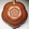
Yixing
@Bok
This wasn't a vendor. It was a member of one of those Chinese F1 groups on Facebook.
So in your opinion, this statement is even wrong for F1 pots?
https://www.facebook.com/groups/3658180 ... 735839332/
I attached a screenshot of the pot to this post. In case you are not a member of this group.
@OCTO
Thanks

- Attachments
-
- IMG_20210708_070803.jpg (216.71 KiB) Viewed 3338 times
Not sure. Maybe also just repeating what they were told by whoever they bought it from? What’s for sure is that they did not have much of what today would be called “quality control” in place.Mark-S wrote: ↑Thu Jul 08, 2021 12:10 amBok
This wasn't a vendor. It was a member of one of those Chinese F1 groups on Facebook.
So in your opinion, this statement is even wrong for F1 pots?
https://www.facebook.com/groups/3658180 ... 735839332/
I attached a screenshot of the pot to this post. In case you are not a member of this group.
OCTO
Thanks

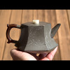
This pot’s lid doesn’t look too different though.
What happened sometimes is that the craftsman took a different batch of clay for different pieces of the same tea pot, maybe that’s what happened here. Batches of the same kind of clay were sometimes slightly different in colour.
Good explanation, thank youBok wrote: ↑Thu Jul 08, 2021 12:39 amNot sure. Maybe also just repeating what they were told by whoever they bought it from? What’s for sure is that they did not have much of what today would be called “quality control” in place.
This pot’s lid doesn’t look too different though.
What happened sometimes is that the craftsman took a different batch of clay for different pieces of the same tea pot, maybe that’s what happened here. Batches of the same kind of clay were sometimes slightly different in colour.

I attached another example from Facebook to this post.
It's always hard to know if statements in those groups are true or false. For antiques I've now rented a couple of good books for about $140. It's not inexpensive, but at least I know that at least most of it is true.
- Attachments
-
- IMG_20210708_080033.jpg (232.08 KiB) Viewed 3327 times
@Mark-S
Just for fun's sake..... personally, I won't give this pot a second look (if I'm on a lookout for a nice vintage pot). The lid is completely mismatched to the original design of a "Tao Ba Xi Shi" of that era. Though one may argue that this could be na odd one off.... it still have, IMO, zero collectable value if u're looking from an investor/collector's point of view. It's not a bad pot... it's just not THE POT... hahahaha....
my 2cents.... don't flame me.. hahahahahaha......
Cheers!!
Mark-S wrote: ↑Thu Jul 08, 2021 2:06 amBok
I didn't think of this...
OCTO
I wasn't going to buy this (and I don't think it's for sale).But it's interesting that you think this pot isn't collectible. Sometimes, I like mismatched lids and I would not care if it's collectible to other people. However, in this case I agree with you.
As I am sure you are aware, that is a very subjective opinion - I personally really like the contrast between the different calligraphy styles. There is an art to how they balance each other.Bok wrote: ↑Wed Jul 07, 2021 10:55 pmsteanze Thanks for that.
From a design perspective I do find it regrettable that they always chose to combine two vastly different calligraphy styles, which do not go well together, even if on opposing sides of the teapot...
Another odd stylistic choice is to sometimes write the characters in 90 degrees angles around the pot. Did they expect peopl to tilt their heads or hold it vertically to read?
Not sure what you mean about the 90 degrees angles...
There is indeed an art to combining radically different styles of typefaces/calligraphies, it is one of the most difficult tasks for any calligrapher/designer. I have to agree to disagree, most, all actually, Yixing I have seen, fail at getting this dynamic-tension-balance right...
Some have the writing in 90 degrees to the level line of the pot.so going around it like on a wheel. Basically vertically written in the top to bottom style, but applied at an horizontal angle, which I find a very odd design decision.
Anyways, the designer in me is having a rant at these, rant-mode-off
@Bok you got OCD!.. hahahahaha....Bok wrote: ↑Thu Jul 08, 2021 9:15 amThere is indeed an art to combining radically different styles of typefaces/calligraphies, it is one of the most difficult tasks for any calligrapher/designer. I have to agree to disagree, most, all actually, Yixing I have seen, fail at getting this dynamic-tension-balance right...
Some have the writing in 90 degrees to the level line of the pot.so going around it like on a wheel. Basically vertically written in the top to bottom style, but applied at an horizontal angle, which I find a very odd design decision.
Anyways, the designer in me is having a rant at these, rant-mode-off
I am a sucker for deep strong strokes that translates authority, strength and confidence.
Haha, call it professional passion for the cause
If calligraphies I tend to prefer the deep carved ones as well.

+1 give me deep strong characters on my pots. Unless it's a small Mengchen style pot.OCTO wrote: ↑Thu Jul 08, 2021 9:21 amBok you got OCD!.. hahahahaha....Bok wrote: ↑Thu Jul 08, 2021 9:15 amThere is indeed an art to combining radically different styles of typefaces/calligraphies, it is one of the most difficult tasks for any calligrapher/designer. I have to agree to disagree, most, all actually, Yixing I have seen, fail at getting this dynamic-tension-balance right...
Some have the writing in 90 degrees to the level line of the pot.so going around it like on a wheel. Basically vertically written in the top to bottom style, but applied at an horizontal angle, which I find a very odd design decision.
Anyways, the designer in me is having a rant at these, rant-mode-off
I am a sucker for deep strong strokes that translates authority, strength and confidence.
I'm still training to find a powerful lishu pot.